Wednesday, 29 March 2017

SCRIPT FIVE: The Park Scene

This is both mine and my partner Hannah Fletcher's ideas.

D: Will, where are we?
W: I don't know Darcy, I can't tell 
D: I'm scared. What if we never get home? 
W: Don't worry we'll find a way. We have each other.
D: I love you Will 
W: I love you too 

Ideas for extra snippets: 
  • Walking around (NOT HOLDING HANDS)
  • Will telling joke and them laughing. Darcy pushes Will and then they both look at each other. D: Oops. 

Tuesday, 21 March 2017

Music Magazine: Font of Title

I have decided to use dafont.com to create the title for my magazine. I have found nine different designs to starts off with that I thought could work for my project.
                                                                                                       

For each design I have included the name of the font and who it is by later on after I have decided which font I will use I will be easily able to find it. I set the font out like this so I can print it off and ask several people of my target audience which they think is the best for my magazine cover. 

Here is a table of my results: The graph below shows the amount of votes each font received from my audience.


In the end my audiences top three favourite fonts were the following: 
1) Lemon/Milk (joint with second)
2) Al Hellvertigo 
3) Flea Market Finds

I have decided to keep the top three just in case the title does not fit the type of magazine I was going for or could not keep to the standard I wanted. However, I do not think I will use the third choice- Flea Market Finds as I do not think it is suitable for the masthead of my magazine as it does not fit the conventions. 

Thursday, 9 March 2017

Billboard Posters: Conventions


  • Title of the film
  • Main Characters
  • Date of release
  • Character takes the main focus of the poster 
  • Image is big and bold to standout 
  • Two or three colours 
  • Catch phrase for/from movie
  • Actors Names (if well known)
  • Production Company's name 

Wednesday, 8 March 2017

Film Magazine: Mockups

I decided to create a couple of magazines mockups using different images not just my own to give me more inspiration in the photos I could make for my product. This will also give me an idea on what works and what doesn't make my actual product an easier process. 

Billboard Poster: Mockups

I have created these mockups for my billboard poster using Canva. I decided to use this product rather than the actual software I am planning to use because the products are just meant to give me more of an idea how the images and text fit together and this website is very quick and easy to use. 


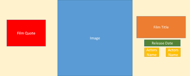
Billboard Poster: Layouts


These are the layouts for my billboard magazine that I have created using PowerPoint. These will give me ideas when making the real billboard posters. From research I have done around this print product I have tried to use to conventions so my product will look as realistic as possible. 


Film Magazine: Layout Designs

These are the layouts for my film magazine. I have done some research on the conventions of magazines to help me create my print product. I created the layouts using PowerPoint. 


Movie Poster: Inspiration


What are typical conventions for movie posters? 

Poster No. 1:
This poster is one of Disney's latest movies; 'Maleficent' which is released in 2014. This movie is described as a 'dark fantasy' and the movie belongs to the following genres; action, adventure. fantasy and romance. 

From this movie poster you are able to tell that that this movie belong to a fantasy from the clothing the actor is wearing (Angelina Jolie) however, this movie poster does not give anything else away leaving it a mystery to the audience. The poster has opted for a dark against light theme, keeping it classy and so it stands out. The poster is very simple and challenges the conventions of a magazine as most of the poster is blank. The actor stands out to the audience as the poster is very blank apart from her red lips which draws all your attention to her. 

Poster No.2:
This poster for 'The Grey' was released in 2014. The movie is a mixture of an action and drama genre film. The film was written and directed by Joe Carnahan, who is also known for the film 'The A-Team'. 

The poster for 'The Grey' has taken up all the available space fully, they have decided to really focus on the character, keeping it simple but also to grab the audiences attention. By filling up all the space it is creating the illusion of its importance, this means the audience will take their time to look at the poster. Once again the colour scheme is nothing too out there but, the use of the bright blue eyes helps to draw attention to the magazine as it stands out from the other dark colours. 

Poster No.3:
The third poster is for the film 'Donnie Darko' a fantasy-drama film released in 2001.  

For the poster they have included the rabbit skull mask that is worn, this has become a symbol for the film and is highly recognised for the film 'Donnie Darko' this refers to Barthes Codes theory about leaving clues in the narrative for the audience to spot. The rabbit skull mask is a huge part of the movie, it makes sense to include it on the poster.

Poster No.4:
'Star Trek' is a huge science-fiction  sequel. There is around thirteen different movies and also has its own animated show. This particular film is from 2009 and was distributed by Paramount pictures. 

For this poster they have included three of the main characters, the audience will already know these characters from past movies and therefore will want to see them involved on the poster. The background is just white, keeping it plain and so that the poster isn't too dark. The characters are looking straight into the camera to show mode of address which will help create a connection between them and the audience. 

Tips, Conventions for a Movie Poster:
  • Big Title: Make sure the title is big so it the audience can read it at one glance. 
  • Follow the Conventions: Moving too away from the conventions of a movie magazine may make your poster not look like a 'real' movie magazine or the audience may think you're selling something else. 
  • Avoid too many colours: To make the poster to stand out more use a fewer colours that are contrasting. 
  • Actors/Actresses names: Including any famous actors in your movie helps bring a bigger audience to your movie.
  • Catchy Tagline: A tagline gives a bit more information about the movie but also makes your movie/poster more memorable. 
  • Age Certificate: By adding this it means the audience know what the minimum age is
  • Simple Background: The simple background won't take any attention from the important information. 
  • Release date: The date is important part of information that the audience needs to know. 
  • Website and Social Media: So if the audience want to find out any more information about the film they can find it easily. 
http://www.chrisjonesblog.com/2012/11/how-to-design-a-movie-poster-%E2%80%93-top-ten-tips-to-grab-the-eye-of-a-sales-agent-distributor-or-audience-member.html

Film Magazine: Empire Inspiration


Empire is a film magazine that look at mainstream and art film. The magazine is published monthly by Bauer Consumer Company. The magazine was first published in July 1989, so has been around for the past 27 years. It is the biggest movie magazine it gives; exclusives, behind the scenes and critics reviews of films.

Regular features:

  •  A transcript from a notable scene
  • Top Ten feature lists
  • Re.View Section - Critic Kim Newman 
  • How much is a pint of milk? - Asking celebrities silly questions
  • Spine Quote- Random quote readers have to identify what movie it is from to win a prize